← Ben Clower
Case study
CommonAlly
A political engagement app where users owned their data and decided who got to buy it.
2021 / research and design / with one other designer
Discovery: everything is found by asking, not by ranking
The problem
Get 18 to 25 year olds involved, and let them own what they give up to do it.
Young people are the demographic political organizations most want to reach and understand the least. The data those organizations buy to reach them gets collected and traded without the people in it ever seeing a cent or a say.
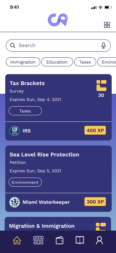
CommonAlly was two products in one package. A place to find political organizations, events, and candidates, and a marketplace where users could sell their own data on their own terms. Engagement was the reason to show up. Ownership was the reason to stay.
The neutrality constraint
The product could not endorse anyone, including by accident.
The app listed organizations, events, and candidates from across the spectrum, and it could not put a thumb on the scale for any of them. That is a design constraint before it is a policy one. Ordering, defaults, iconography, and the language around a listing all communicate endorsement whether or not you intend them to.
It ruled out the shortcuts a discovery interface normally leans on. No editorial picks, no trending ranking that quietly rewards whoever is loudest, no visual treatment that made one kind of listing look more legitimate than another. Discovery had to be driven by what the user asked for, not by what the product thought they should see.
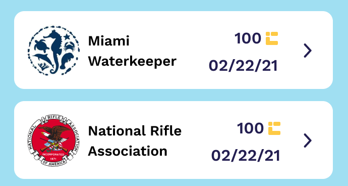
Two buyers, one treatment. No ordering, no emphasis, no editorial hand.
My role
This started as a design bootcamp placement with a real client shipping a real product. I worked alongside one other designer on research and design end to end. When the program finished, the founders hired me directly to complete the work.
That second half is where the interesting problems were, because by then I was not executing someone's brief. I was arguing about what the product should be.
Research
The gamification the founders wanted did not motivate anyone we talked to.
I ran user interviews and usability tests throughout. The finding that mattered most was the one that contradicted the plan: the founders were invested in gamification, and users cared about it far less than anyone hoped. Badges, streaks, and progress mechanics did not motivate the people we talked to.
What they responded to was the concrete offer underneath. Real control over their data and something real in return for it. That reordered the product: the reward system had to be worth something outside the app, not inside it.
Dataprint
Everything the app knew about you, in one place you controlled.
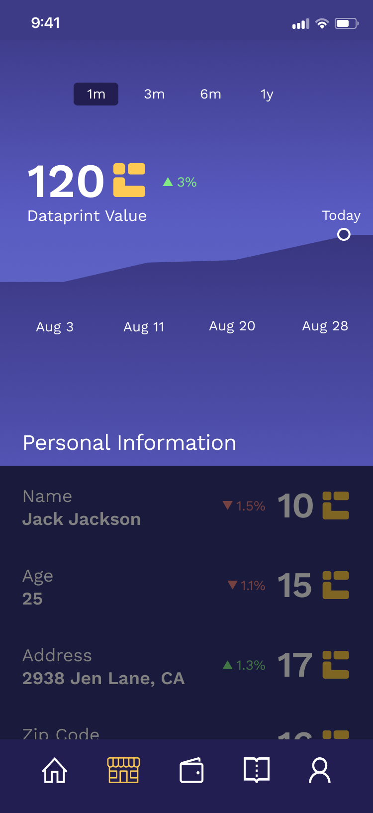
A user's Dataprint was everything the app held about them: personal information plus every action they had taken in the product. Rather than bury that in a settings screen, we made it the object the user manages.
Users toggle what is for sale and what is not. When a buyer wants a dataset that includes them, they get asked, and they can opt out based on who is asking. The identity of the buyer is part of the decision, which is the part most consent flows leave out.
A data marketplace only feels different from surveillance if the user can see exactly what is on the table and say no to a specific buyer. That was the whole design brief for this surface.
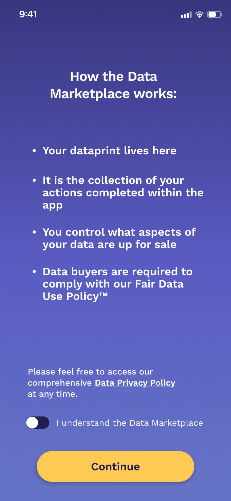
How the marketplace works, and the Dataprint itself
The hard problem
Revenue that does not wait for scale.
The founders' monetization plan was a cut of each data transaction. That works, eventually, if you get big. A percentage of a small number is a small number, and it gave the company nothing to live on in the years before that.
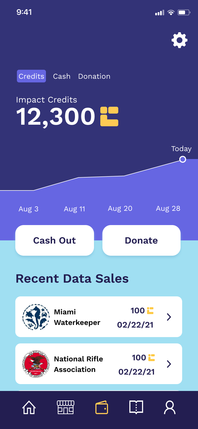
Users earn in-app currency and cash it out. My proposal was to make the exit asymmetric. Cash out to donate to a cause and you get the full value, one hundred percent. Cash out to take the money yourself and you get a reduced rate, with the difference staying with the company.
The logic came from who was already in the room. This is an app for political activity, so most of its users are activists or on their way to becoming one. Giving to a cause is not a hypothetical behavior for that audience, it is the behavior. The design makes the generous choice the more rewarding one and takes its margin from the selfish one.
It monetizes from day one, it does not require scale to function, and the fee never feels like a fee, because the alternative is not paying less, it is giving more. The founders took to it immediately.
Cash out: donate at full value, or take a reduced payout
On the record
The app launched. I am not in touch with the company and have no usage data, so there are no numbers on this page.
What I take from it is a working method for monetization design: look at what the audience already wants to do, and build the business model out of that behavior instead of taxing it.
What I would do differently
Test the gamification assumption sooner
It was in the plan before it was in front of a user. Putting it in front of people earlier would have redirected months of thinking.
Pressure test the donation rate
The model rests on enough people choosing to donate. I would want that split measured in a live test before the company depended on it.
Design the buyer side too
I designed the marketplace entirely from the seller's view. The people requesting datasets were the other half of it, and understanding what they needed would have sharpened what we asked users to offer.
Elsewhere