← Ben Clower
Case study
White-label banking software
Online banking that small banks could put their own name on.
2021 / Fiserv / sole designer / 2 engineers, 1 QA
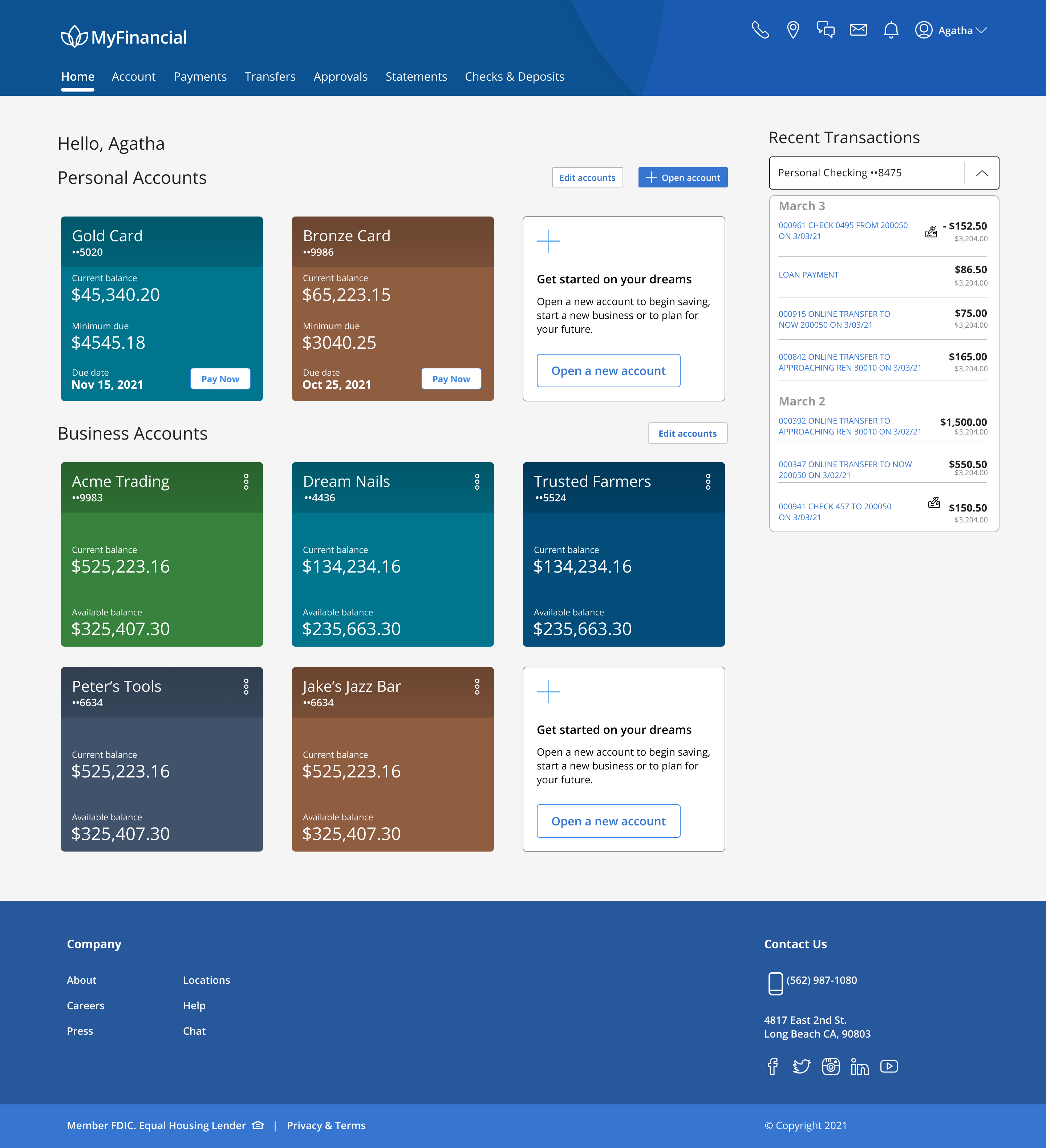
MyFinancial account home
The problem
Small banks needed an online presence they had no way to build.
Community banks and credit unions were competing against national institutions with entire product organizations behind them. Building online banking in house was never going to happen at their scale, and their customers had stopped grading them on a curve.
Fiserv's answer was modular: a full banking product a bank could plug its brand into and launch. That made modularity the product itself rather than an implementation detail, and it set the terms for every design decision that followed.
The constraint
Designing for a user I would never meet, in a brand I could not see.
Every screen had to survive an unknown institution's colors, type, and logo, in combinations nobody had approved in advance. A layout that only worked because of a particular accent color was not a layout, it was a coincidence.
So the work moved to the layer underneath. Hierarchy had to come from structure, spacing, and weight rather than color. Destructive and safe actions had to stay distinguishable when a client's palette flattened the difference between them. Every component had to hold at the extremes of the type ramp, not just the sizes I designed against.
The test for any screen was simple: would this still be clear if someone swapped the brand out tomorrow? That question decided more than any other input on the project.
My role
Sole designer in a pod with two engineers and one QA. I owned five features end to end, from flows through final specs, and worked directly with engineering through build and release.
01
Create scheduled transfer
02
Edit scheduled transfer
03
Cancel check
04
Create account
05
Move account
Cancel check
A painted door, before building the thing behind it.
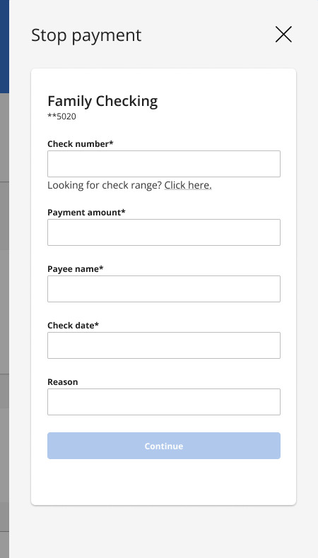
Cancelling a check is a destructive action taken by someone who is usually already anxious. They have lost a check, or sent the wrong one, and they are hoping they are not too late. The flow needed to be unambiguous about what would happen and irreversible only at the point where the user had confirmed they understood.
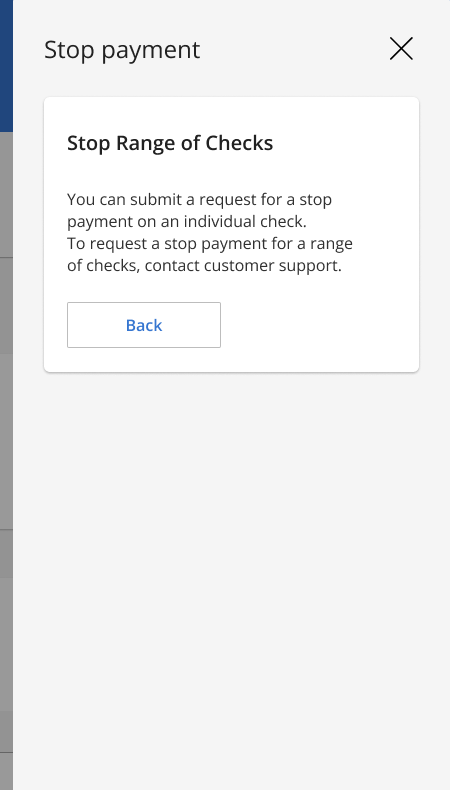
The open question was ranges. Cancelling a run of sequential checks is a real need, and building it meant meaningful backend work across every institution on the platform. Rather than assume, we shipped a painted door: the entry point for cancelling a range existed in the interface, and selecting it told the user the capability was not yet available.
It let us measure demand for a feature at a fraction of the cost of building it, and it kept the decision with the people who would have paid for it.
Cancel flow, and the painted door for check ranges
Scheduled transfers
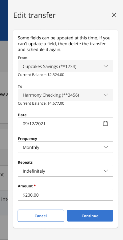
Editing a scheduled transfer was the harder problem.
Most transfer flows optimize for setup and treat editing as an afterthought, which is backwards. People set a transfer once and then live with it for years, editing it whenever their pay date shifts or a bill moves. Edit is the flow they actually return to.
The design problem was scope: whether a change applies to the next occurrence or the whole series. Getting that wrong silently is the worst outcome in the product, because the user believes they fixed something and finds out a month later that they did not. I made the choice explicit at the moment of editing rather than burying it in a confirmation.
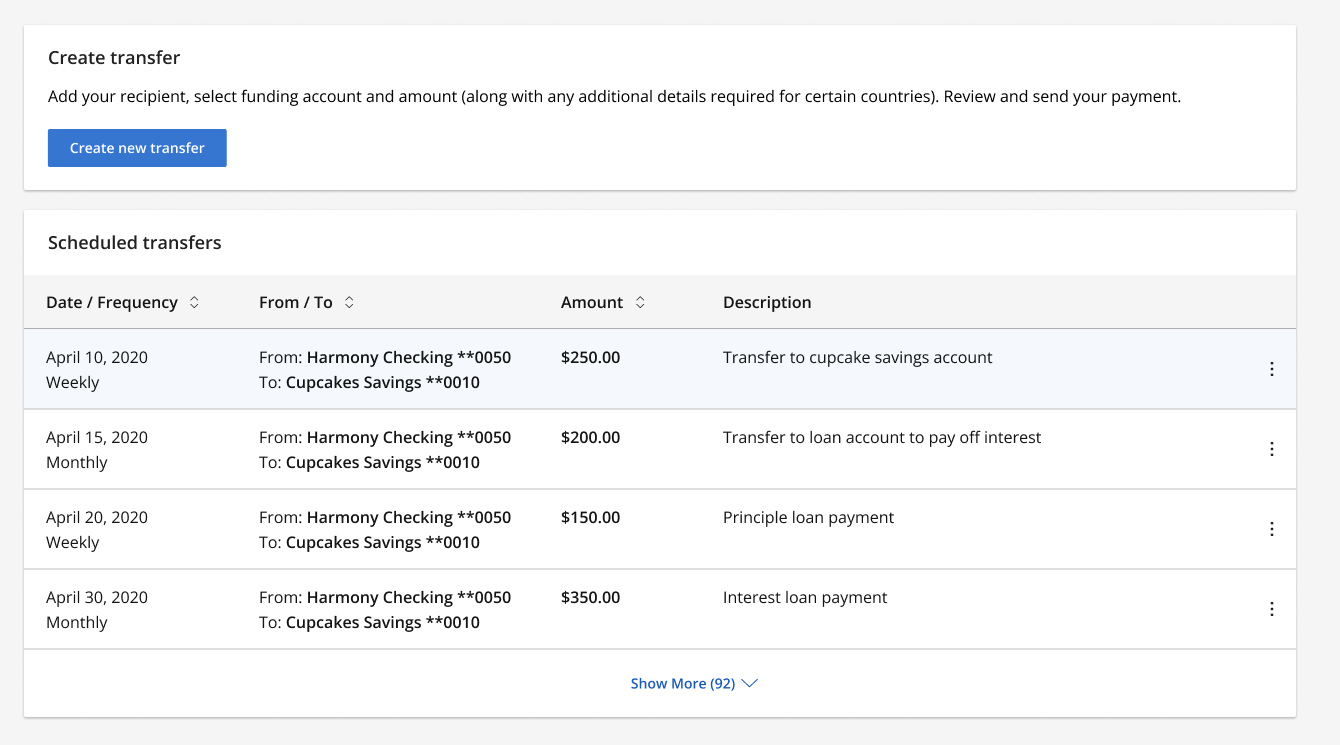
Create and edit a scheduled transfer
Account lifecycle
Opening and moving accounts, without a banker in the room.
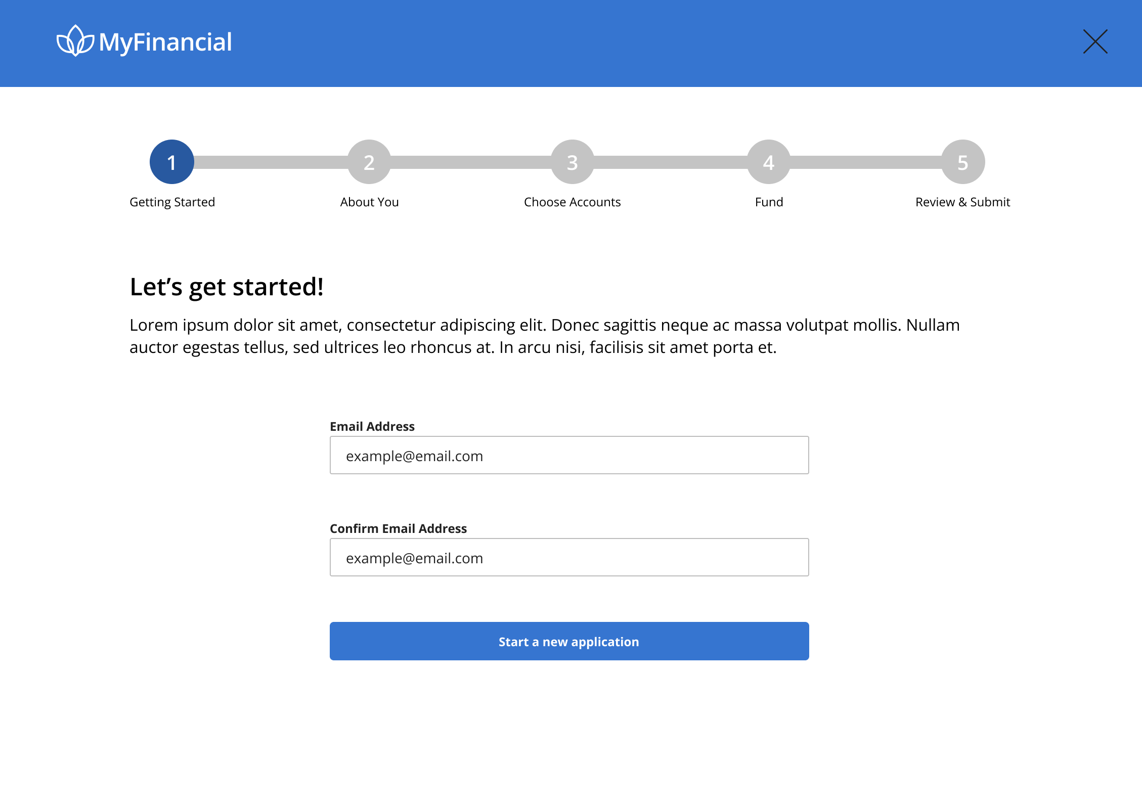
Create account and move account both replaced conversations that used to happen at a branch desk. That is the part people underestimate: a banker answers questions as they come up, and a form cannot. Every ambiguity that a person would have resolved out loud has to be resolved in the interface, before it is asked.
Both flows had to work identically for an institution with three account types and one with thirty, which meant designing the structure rather than the specific case.
Account opening, the first of five steps
On the record
I left Fiserv in 2021 and do not have access to usage data for any of this work, so there are no adoption or performance numbers on this page. What I can speak to is the reasoning, the constraints, and the tradeoffs, all of which I remember clearly because they shaped how I have worked since.
The habit that stuck is the painted door. Shipping the entry point to a feature before committing to the feature is the cheapest research instrument I have used, and I have reached for it repeatedly since.
What I would do differently
Design the theming, not just against it
I treated the brand variables as a constraint to survive. The better move is to define what a client can and cannot change, so the system stays intact by design rather than by discipline.
Instrument the painted door properly
We put the door in the product but did not define up front what result would justify building the feature. A threshold agreed in advance turns a signal into a decision.
Keep my own record
The reason this page has no numbers is that I did not capture them while I had access. I document outcomes as they happen now.
Elsewhere