← Ben Clower
Case study
QuickView
The daily operating tool for frontline leaders at Delta Air Lines.
2022 to now / sole designer / 796 leaders / mobile, tablet, web
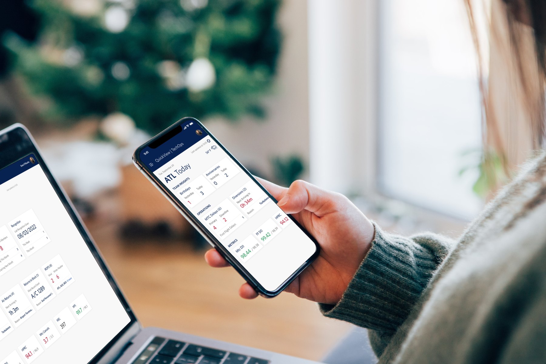
QuickView in use, phone and desktop
96%
adoption, 796 leaders
1.6 hrs
saved per day, self-reported
4.12 / 5
leader eSAT, 422 responses
Context
Leaders run the operation. Their information lived at a desk.
Frontline leaders at Delta run the operation where it happens: gates, ramps, and service counters. What they needed to lead sat somewhere else, scattered across disconnected systems and often weeks out of date.
The initiative began with an outside concept from IBM. We took it as a starting point, then went and asked ACS members across every level what their day actually looks like.
The before state
01
Metrics arrived monthly
Leaders coached teams and made operational calls against numbers up to 30 days stale.
02
Nothing reached the floor
Every data need meant walking back to a desk, and IROPS such as delays and diversions never reached a leader-facing tool at all.
03
Team info was fragmented
One team member's contact or HR details could mean three separate systems, and scheduling varied station to station.
My role
One designer, three verticals, two pods.
Design started as a two-person team. My counterpart moved to another project in year two and I have been the sole designer since, owning Team Management, Operations, and Metrics across mobile, tablet, and web.
As the product matured I moved past the design surface into planning. Ahead of every increment I sit with the product owners and help shape what goes in, weighing research findings against design debt and engineering capacity.
Today: 1 designer / 2 pods / 6 engineers / 3 QA
Research
The workshops rewrote the concept we inherited.
Recognition moved to the top
IBM buried it at the bottom. Leaders told us celebrating their people is how they start the day.
Cards became a table
Leaders scanning dozens of flights wanted density and sorting, not cards. That table became a reusable pattern across the whole product.
IROPS and weather split
IBM merged them because they affect each other. Users saw two different jobs that needed two different features.
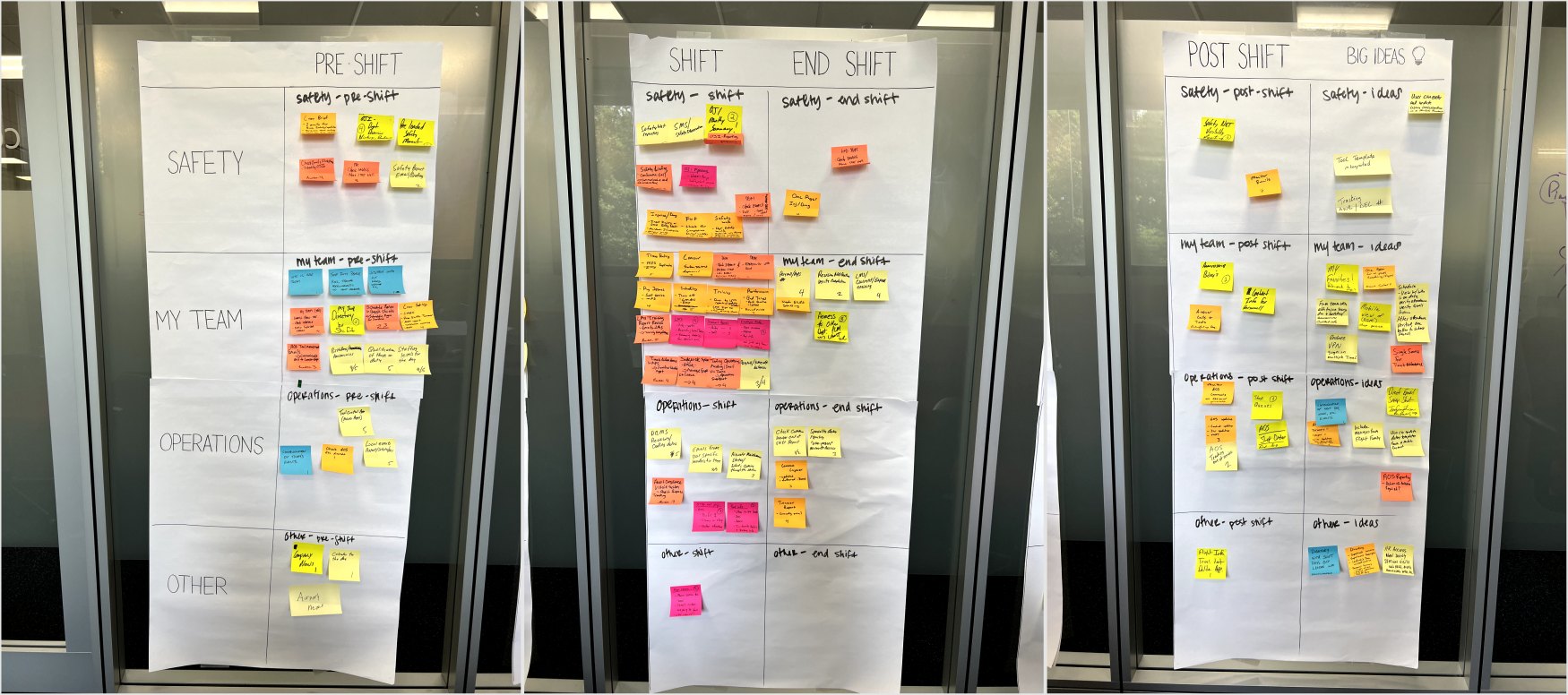
Those reversals came out of facilitated workshops where ACS members mapped every task they perform across the shift timeline, color coded by role. We digitized the board in Figma and broke it down into a grounded inventory of the real daily work. The architecture came from that, not from the concept.
The workshop board, before digitizing
The argument
Live metrics, over the objection of the team that owned them.
Performance metrics reached leaders on a controlled monthly cycle, owned and pushed out by a central scorecard process. The obvious digital version of that is a monthly scorecard on a screen.
I argued for mirroring the live data instead. Leaders managing a by-the-minute operation should not coach from last month's picture. The pushback came from the scorecard team, and it was fair, since live numbers get consumed and discussed before anyone contextualizes them.
We made the case and won. The metrics view became part of the daily habit, and 84% of active leaders now open the app 7 to 8 times a work week. A refresh of how that data is presented is planned for Q1 2027, informed by two years of live usage.
The system
Every feature was three layouts, solved three times.
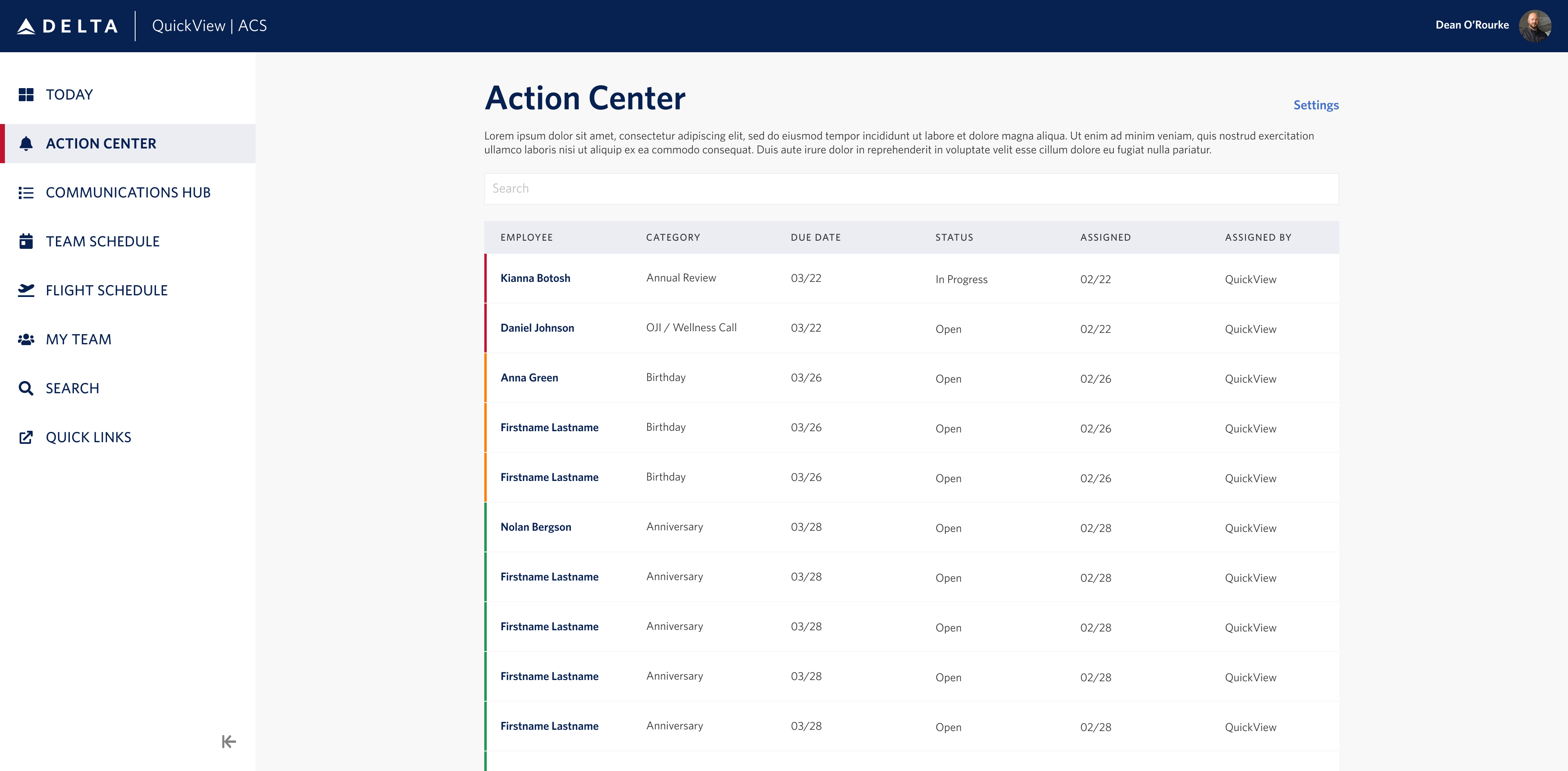
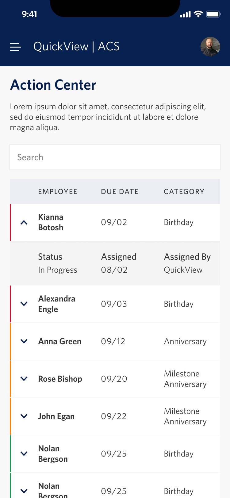
Early features were built mobile first or desktop first, case by case, and tablet rarely looked right in either direction. Rather than keep solving each screen by hand, I designed a scalable table pattern with nested, expandable child rows. Table-shaped content now adapts across all three platforms by default.
It turned a recurring per-feature struggle into a solved problem. As a solo designer serving two pods, that leverage is the only way the math works. It is also the table leaders asked for in the workshops, made reusable.
One table pattern, desktop and mobile. Mixed aspect ratios sit in a shared frame.
The constraint
The data did not exist, so we built it.
Legacy APIs gave us less than users wanted. Only two types of weather IROPS were available at all, and delays arrived coded or uncoded, always after the fact. Leaders wanted to see risk before a delay happened, and no upstream system offered anything like it.
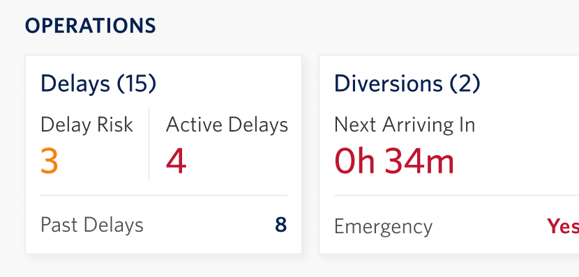
Working with frontline SMEs, I co-developed a heuristic that flags at-risk flights using progressive operational readiness checks against departure time, with distinct logic per flight profile, because our SMEs knew one model would not fit international and domestic alike.
It shipped as the Delay Risk indicator, a forward-looking signal that did not exist anywhere in the enterprise.
Delay Risk on the Operations card
Outcomes
96%
adoption across the ACS division's 796 frontline leaders
84%
of active leaders in-app 7 to 8 times per work week
1.6 hrs
saved per day, self-reported, n = 236
71%
agree the tool freed up their time
4.12 / 5
leader eSAT across 422 responses
Monthly
release cadence, accelerated from quarterly
What I would do next
Four years in, I see the seams clearly. The visual language is dated and the IA grew by accretion instead of intention. The next evolution reorients the home experience around one rule: what needs the leader's attention comes first.
01
A prioritized briefing surfaces emergencies, metric breaches, and team moments in one glance.
02
An Action Center consolidates every leader task into a single workflow.
03
AI moves from a destination to an ingredient, ranking and summarizing instead of waiting to be asked.
Reflection
Living with shipped decisions for years teaches more than starting over ever could. Four years on one product surfaced problems no six-month engagement would have reached.
Demand from adjacent divisions taught the harder lesson: a product designed deeply for one operation does not fit another by default. And we built awareness first, so consolidating leader actions into a single workflow is the chapter I want to write next.
Elsewhere